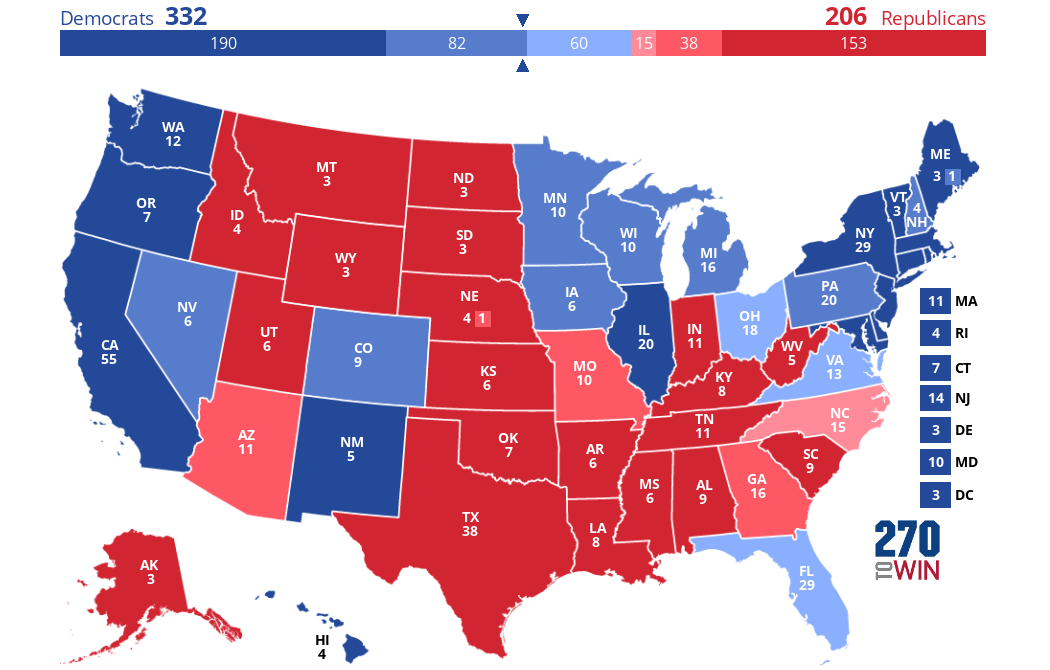
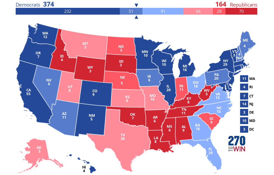
First, as a reference, let's look at the actual results of the 2012 election (taken from Wikipedia and made on 270towin.com):
Anyway, what's the answer to the question in the first sentence of this post? What would the outcome of the 2016 election have been? To answer this question, I used data from Dave Leip's extremely useful Atlas of Presidential Elections and created this map (or "map #2"), also on 270towin.com (note that all subsequent maps are colored the same way as the first one):
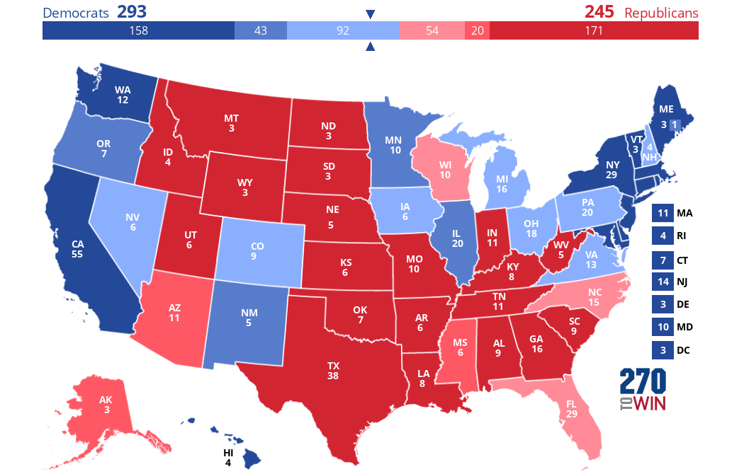
So the answer, in short, is the Democrat wins the Electoral College 293-245. This would have represented the Democrat getting 57 more (and the Republican getting 57 fewer) electoral votes than their party's candidate actually did in 2016. Note that, although this is not shown in the map above, there are 3 states expected to have margins of <1% here (and which could thus be marked as tossups): WI, NV, and PA.
Perhaps the most notable thing about this map is that, with respect to the party that wins each state, it is identical to the 2012 electoral map with only two exceptions: Florida and Wisconsin have both flipped from D to R.
What else changes in this predicted map compared to the 2012 results? NV, CO, IA, MI, PA, and NH all turn a shade lighter blue, while MO, GA, and the 2nd congressional district of NE all turn a shade darker red. Mississippi and Alaska both turn a shade lighter red because Obama did better there in 2012 than in 2008, to the extent that both states are expected to be won by the R candidate by between 5% and 10% in 2016.
Here are the states where the margin in 2016 is predicted to be <5% either way. States predicted to flip will be underlined from here on out.
| Michigan | 2.5% | |
| Iowa | 2.1% | |
| Colorado | 1.8% | |
| New Hampshire | 1.6% | |
| Virginia | 1.5% | |
| Ohio | 1.4% | |
| Nevada | 0.9% | |
| Pennsylvania | 0.5% | |
| Wisconsin | -0.1% | |
| Florida | -1.0% | |
| North Carolina | -4.4% |
Notably, in addition to mostly being similar to what happened in 2012, map #2 also comports pretty well with what actually happened in the 2016 election (i.e. Trump won both Florida and Wisconsin), except that he also won four additional pale blue states on this map (IA, MI, OH, and PA). He also won the medium-dark-blue 2nd congressional district of Maine by over 8%, though here it is predicted to go D by almost 6%, and Obama won it in 2012 by almost 10%! We also see that of these eleven states, Clinton won only four of them (CO, NH, VA, and NV).
For comparison, I have illustrated the results of the 2016 election in the map below (map #3).
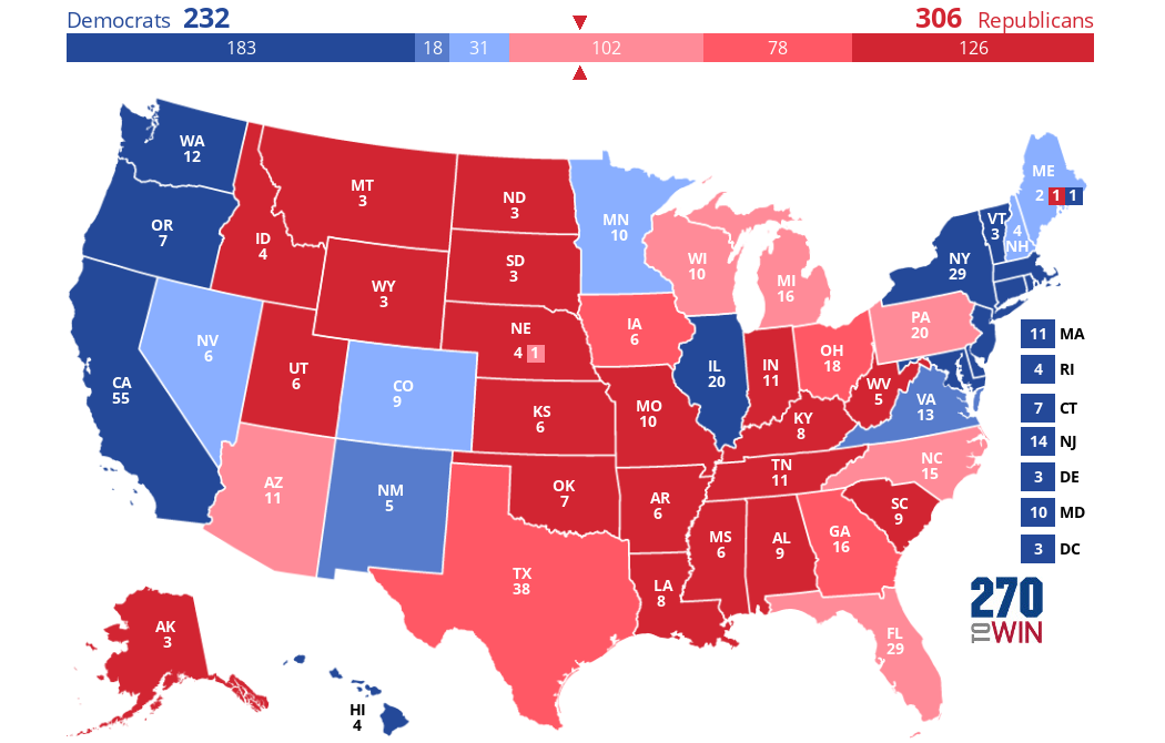
The fact that Trump won every state predicted to be won by the Republican in map #2, as well as 4 states (and 1 congressional district) predicted to go Democratic, further indicates that he did better (at least relative to Clinton) than one would normally expect, even accounting for the generally pro-R shift the country was already undergoing.
In addition to the party differences noted above, here are also some shading differences between map #2 and the actual 2016 election (i.e. states that were predicted to be won by the correct party, but by a margin in the wrong color range) are as follows:
- MS and AK are medium-red on map #2, but both states were dark-red in 2016 (Trump won then both by >10 points).
- TX and GA are both dark-red on map #2, but both states were medium-red in 2016 (Trump won them both by between 5 and 10 points).
- VA is light blue on map #2, but because Hillary won it by between 5 and 10 points, it was medium-blue in 2016.
- ME is dark blue on map #2, but it should be light blue because Hillary won it by <5 points.
- MN and OR are both medium-blue on map #2, but MN should be light blue and OR should be dark blue (Hillary won MN by <5 points and OR by >10 points).
- AZ should be light red, not medium red (as it is on map #2), because Trump won it by <5 points.
- NE's 2nd congressional district is dark red on map #2, but it should be light red, because Trump won it by <5 points.
What about if the 2020 election was based on the shifts that happened from 2012 to 2016? Then this map (map #4) would be the result (same data sources and produced on the same website as above):
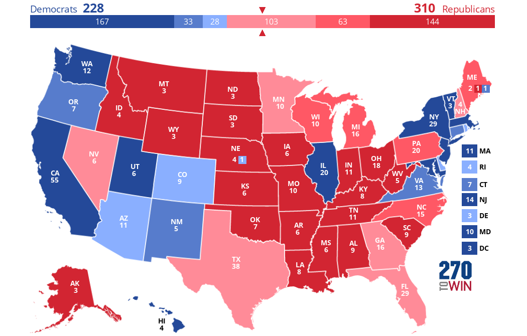
Weird fact: on the website the purple states were shown as having red and blue stripes. Adding the image through its URL here apparently changes the appearance of mixed electoral vote states for some reason. Anyway, here we see the Republican (presumably Trump) getting 310 electoral votes--four more than he got in 2016! This should not be a surprise because of course Trump did better than Romney in 2012, at least in most states; that's the reason he won when Romney didn't. In this map, four states are predicted to flip from D to R: Maine, Minnesota, Nevada, and New Hampshire. (Maine flipping means that Trump would win two of the state's electoral votes; he is also predicted to win its 2nd congressional district again, but to lose its 1st, which would give him 3 votes and the D candidate one vote from the state). Meanwhile, two states--AZ and UT--are predicted to flip from R to D, along with Nebraska's 2nd congressional district.
Utah is a weird outlier on this map because it voted 30 points more Democratic in 2016 than in 2012. So if you take the result of the 2016 election in Utah (Trump wins by 18 points) and add 30 points in the D candidate's favor, this gives you a 12% D win, and since >10% margins here are shown in solid red/blue, Utah is solid blue on this map. But of course the odds of UT shifting 30% towards the Democrats again are pretty low, especially since Romney had no difficulty getting elected there last year. But then again, a recent poll suggests that a slight majority of Utah voters would not vote for Trump next November, so maybe it could happen: clearly voters there like Trump much less than normal establishment Republicans.
Some other weird facts about this map:
- Texas is expected to be really close: Trump is predicted to win it by only 2.2%, making it the second-closest state that he wins (behind only Nevada at 1.9%).
- Rhode Island is also predicted to be surprisingly close, with a D win predicted to be by only 3.6% (Trump shifted it way to the right in 2016). Delaware is a similar story (D expected margin of victory: 4.2%).
- My own state, Georgia (along with Texas, also not typically considered a swing state), is expected to be closer than normal swing states like Florida and New Hampshire. This is caused by the fact that both GA and TX voted more Democratic in 2016 than in 2012--especially Texas, which swung almost 7% in the D's favor.
- Ohio and Iowa, though long considered swing states, are both expected to be staunchly Republican in 2020--Iowa is predicted to be won by Trump by a larger margin than Mississippi, and Ohio is expected to be won by more than South Carolina!
| Colorado (4.4%) |
| Delaware (4.2%) |
| Rhode Island (3.6%) |
| Nebraska (2nd) (2.7%) |
| Arizona (2.0%) |
| Nevada (1.9%) |
| Texas (2.2%) |
| Georgia (2.5%) |
| Florida (3.3%) |
| Minnesota (4.7%) |
| New Hampshire (4.8%) |
And finally, here is a map based on Trump's state-level net approval ratings (as of last month, according to Morning Consult). (Net approval rating = % who approve of Trump - % who disapprove.) Here, the coloring is the same as before, but I should note that if the approval rating was exactly + or -10%, it was placed in the "medium" color category (e.g. net rating of 10% = medium red, not dark red). This affected only two states: IA and NV (Trump's net approval rating was -10% in both states).
So, no surprise, Trump's approval ratings are net negative in every state he lost to Clinton in 2016. The (somewhat) surprising thing about this map is that they are also net-negative in nine states that he won in 2016: namely, AZ, FL, GA, NC, OH, PA, IA, WI, and MI. Of these, Trump's net approval rating is the lowest in MI and WI (both -12%!).
No comments:
Post a Comment