This is an extension of
another recent post on this blog in which I outlined several hypothetical Electoral College maps. First, I want to depict what the results of the 2016 Democratic
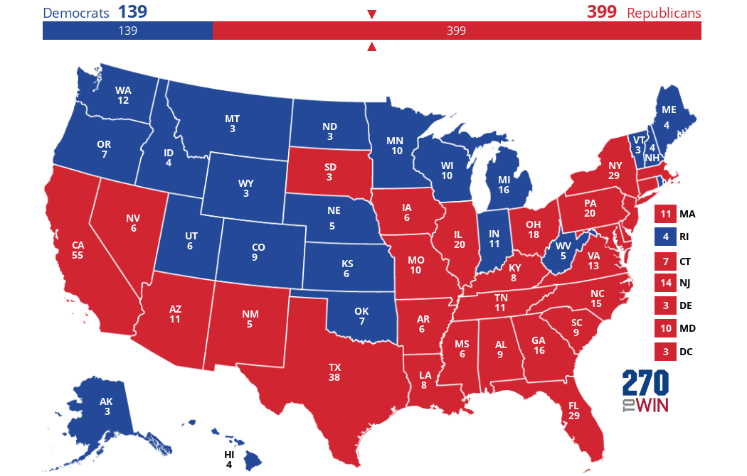
primaries would have been if delegates were awarded winner-take-all, like electoral votes are in general presidential elections. Of course, this also assumes that each state has the exact same number of delegates as it does electoral votes (which is definitely not true); it also ignores primaries in non-state territories like Puerto Rico which can vote in primaries but not in general presidential elections, and the fact that ME and NE have different electoral college systems, but whatever: let's get into it.
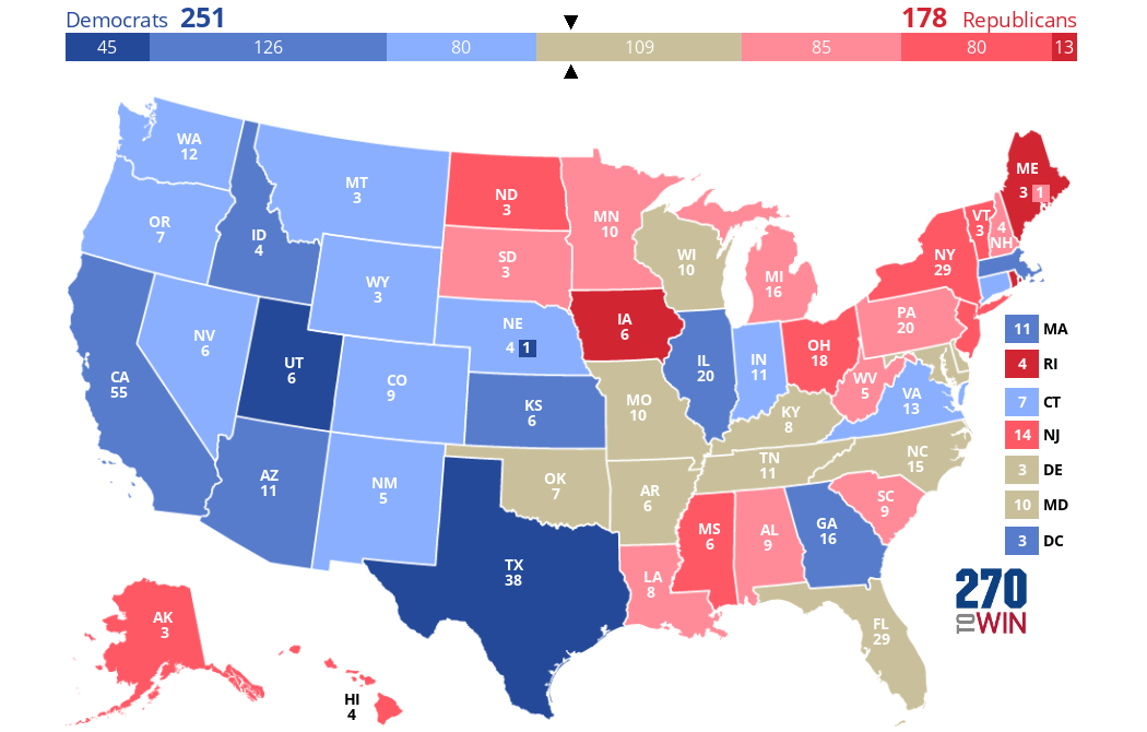
So the map below shows the results of the primaries: Clinton won yellow states on this map while Sanders won green states. Darker yellow = greater % margin of victory for Clinton and darker green = greater % margin of victory for Sanders.
First, let's convert this into an electoral map regardless of margin of victory, with Clinton as red and Sanders as blue:
So we see here a very comfortable victory for Clinton, who wins 399 electoral votes to Sanders' 139. This gives Clinton about 74% of the electoral votes (EVs) to only 26% for Sanders. This, of course, is not very fair because
Clinton only actually got about 55% of the vote in all primaries/caucuses combined, compared to about 43% for Sanders. Part of this disproportionality is because the above map, being winner-take-all, masks the fact that some primaries were much closer than others. This can be seen in my second map, made based on data from the source linked above. States where either candidate won with <50% of the vote are gray on the map below. The three color levels are 50-60%, 60-70%, and 70+%.
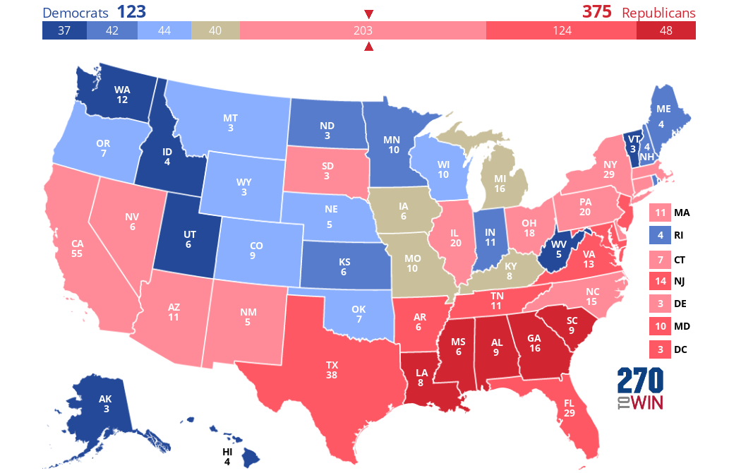
I also wanted to show some maps with different metrics, both related to the general election. The idea is as follows: take the shift from 2008 to 2012, then use that to predict the results of the 2016 election (I already did this in my previous post). Then, take the difference between this prediction and the actual 2016 election results, and create a map of this difference (blue = Clinton did better than this prediction and vice versa). In this map, if the difference is <1% either way, the state will be gray. So here it is:
This map looks quite different from any other map I've looked at regarding the 2016 election. So what we see is that Clinton did much better than expected (based on trends from 2008 to 2012) in Texas and Utah, while Trump did much better than expected in Iowa, Maine, and Rhode Island of all places! This despite the fact that Trump did win IA, but he lost both ME and RI. We also see that most states (29 out of 51 or 57%, including DC as a state and not counting individual congressional districts) were less than 5 points off in either direction from what would be predicted here. Furthermore, we see that Clinton did remarkably well almost everywhere in the west, with the notable exceptions of both Dakotas and Oklahoma. In fact, she did at least 1% better than expected even in some of the most Republican states in the US out west, including Wyoming, Montana, and Idaho (Idaho voted about the same in 2016 as it did in 2012).
Lastly, Clinton's performance in Wisconsin is also very much in line with what would be expected, and even in MI and PA, she did only slightly worse than one would expect. Trump also did only slightly better in WV than you'd expect, indicating that his landslide victory there was actually not very unusual. OH and IA are different stories, however, as Trump did much better in both (especially IA) than you would expect. And most of the medium/dark blue states here also voted more D overall from 2012 to 2016 (CA, AZ, TX, my own state of GA, KS, MA, etc.) It's also notable that NY and VT, among other New England states, voted a lot less Democratic than you'd expect in 2016.
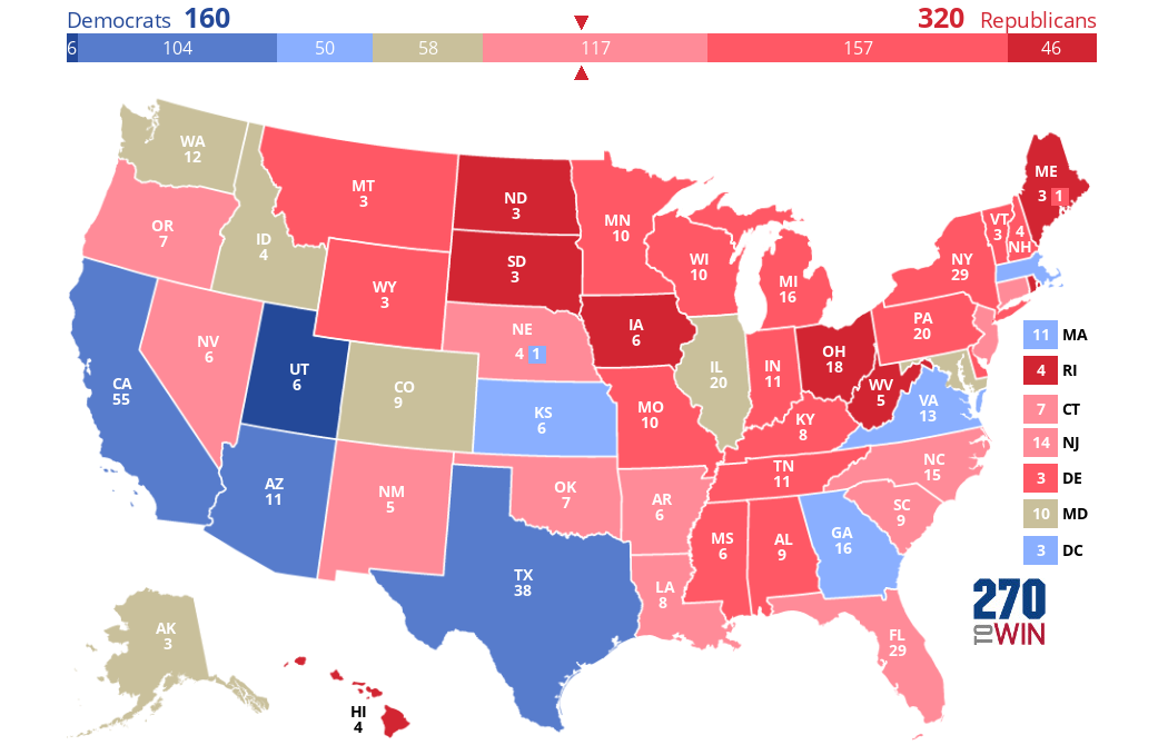
I also wanted to show another map I made based on the 2012-2016 shift in presidential election results for each state. Each value is the average of the shifts from Dave Leip's Atlas and
a Google Doc spreadsheet (with the exception of congressional district results, which I calculated myself).

No comments:
Post a Comment