The map below shows where Trump got a lower % of the vote than Romney (by >1%) in blue and higher % in red. If the diff. is <1% either way, the state is gray. Darkest shade = >10%, then 5-10%, then 3-5%, then 1-3% in decreasing order of darkness/solidness.
What about where Clinton got a higher % of the vote than 2012 Obama (same rules of course, but w/colors reversed regarding higher/lower)?
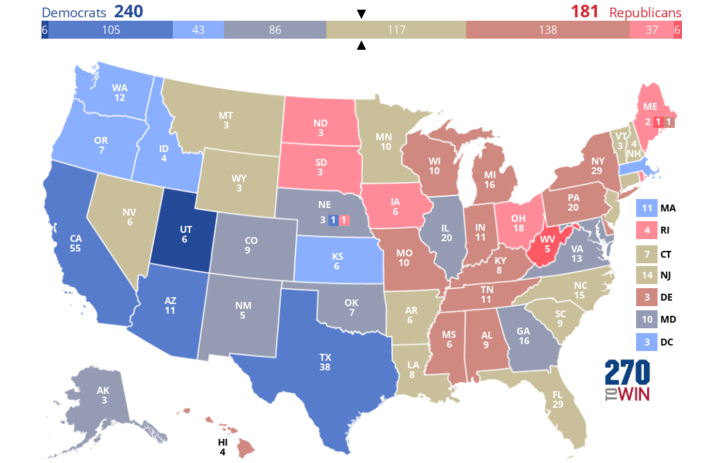
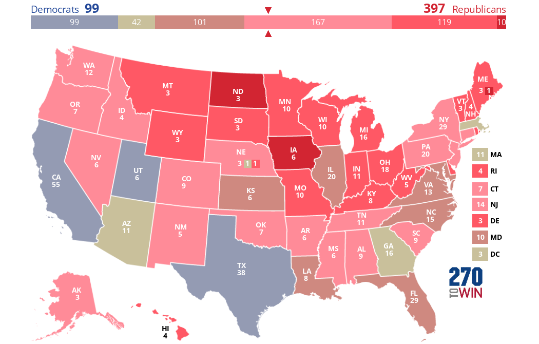
This underscores how the 2016 election was indeed a Clinton loss more than a Trump win. Clinton lost a lot more ground in more places than Obama compared to Trump improving on Romney.
No comments:
Post a Comment